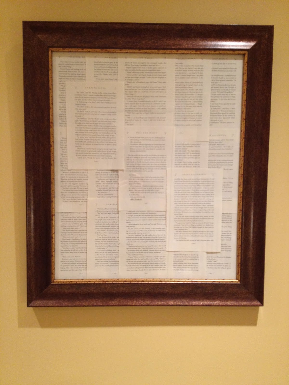
Kate is all moved in. What we thought would take us a couple of hours took all day....again. So the after photos won't be on the blog until I can get back in there and take some decent shots. However, I thought this week I would share some of the art projects we did. Kate is a book lover and I needed a fairly large piece to hang above her bed. But instead of one large piece, I chose to use two for more impact.
I had two framed pieces of art in my studio that I had used in class for years. I probably purchased them at TJs or Home Goods many moons ago. I liked the frames more than what was being framed, so I came up with the idea of framing book pages because we were adding color through textiles, accessories, and paint. Now let me preface this by saying that even though we bought a used copy, Kate and I both had an extremely difficult time defiling a book. In fact, she wouldn't touch it, so I did all the dirty work.
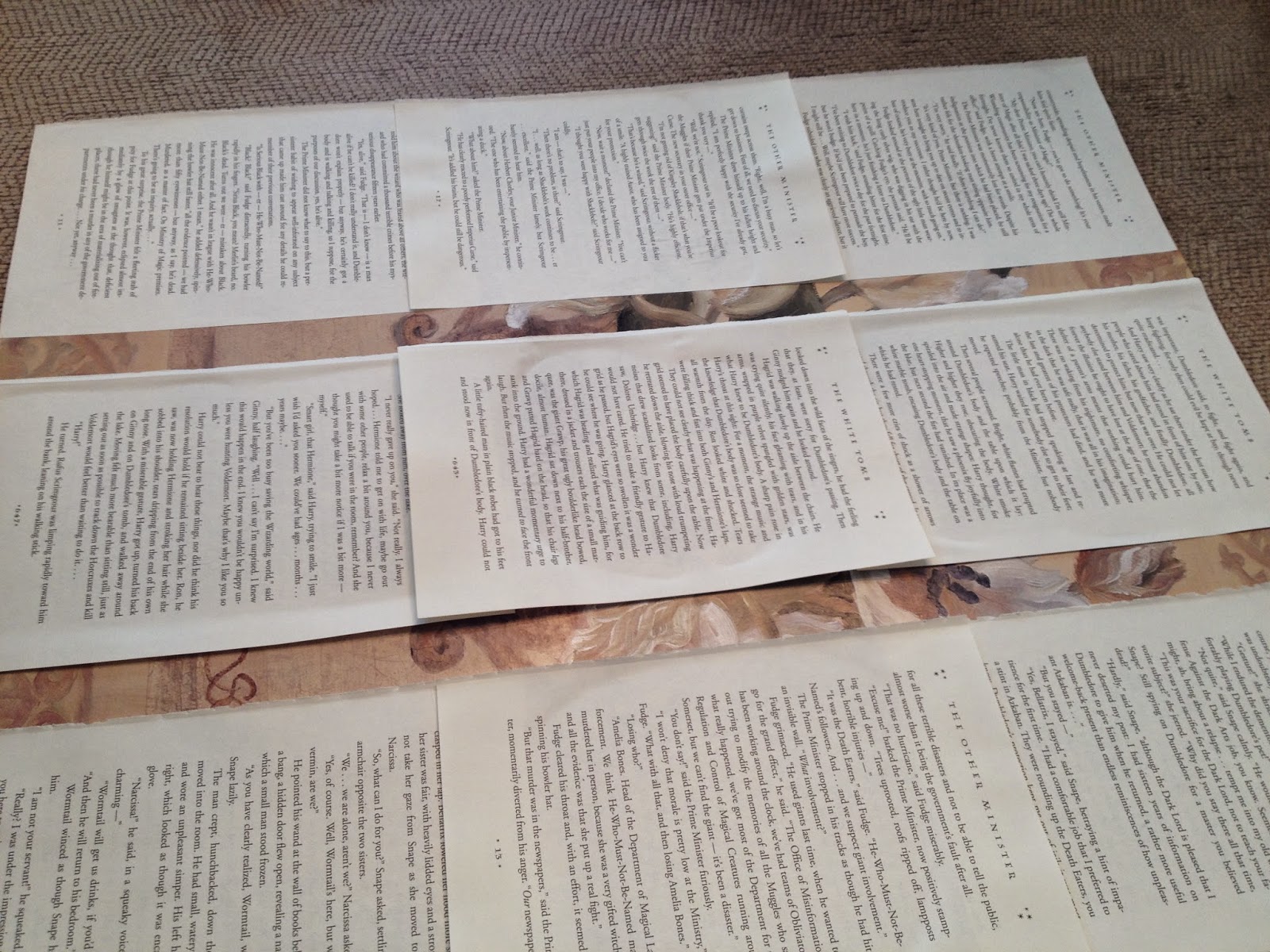
Now I had to fill in the empty spaces with more pages making sure to line up each one to the other. As you can see, I started placing the end pages underneath and switched it up for the two middle rows. When it came time to add the important pages, I knew I wanted one more layer. You can get as creative as you'd like after this stage, but it's very important to have some symmetry in the design when you begin.
Knowing I wanted the center page to lay on top, I started with the end pieces and laid them out the same way I began. To keep it from looking too symmetrical, I placed two additional pages diagonally across from one another. I placed the last pages of the second frame in the opposite direction, so when hung, you would see a "v" formation which you will eventually see in the final reveal.
Art can be expensive and when your budget doesn't allow you to buy much, you need to think about using alternatives (Anything that can be securely safely to a wall is art.). Creating art can be a great way to not only make your home or apartment beautiful, it can allow you to splurge on those big ticket items and really personalize your space.


0 comments:
Post a Comment